Jon Stam

AN IMAGINARY MUSEUM

There is no doubt that the memory function of the museum has been superseded by the electronic archive. Today, networked technology allows us to access information anywhere and at anytime, but a meaningful exhibition-format for this information is far from commonplace.
In this Imaginary Museum, collections by artists and designers can be intimately experienced through digitally hacked View-Master. To view a collection, simply place a disc in the viewer and press lever down to change scene.

initiated by Jon Stam, with Simon de Bakker

http://www.commonplace.nl

IM parts picture by Kristof Vrancken


Christiane Hoegner

TABLESCAPES
Christiane Hoegner is a Brussels based designer, who is working multidisciplinary on projects ranging from objects and furniture to installations, strategies and concept development. She is aware of environmental and social issues and deals with it in her honest, no nonsense designs.

Tablescape is an abstracted piece of furniture. Built according to the OpenStructures grid, it combines various functions, such as sittingplatforms, exhibition space and clustered tables of different heights and forms a hybrid between oversized furniture and microarchitecture.

http://www.christianehoegner.com

Tablescapes


Lore Langendries

(IM) PERFECT DESIGN

Lore Langendries is a Belgium based young designer graduated from the PHL University College,  Arts and Architecture in Hasselt.

She is explicitly balancing the border in between the crafsman and the designer, creating in that way both unica and multiples.

In septembre 2011 she will start her PhD wherein she will develop an innovative design method to unite the designstrategies of the prototypical craftsman and industrial designers in contemporary jewellery design.

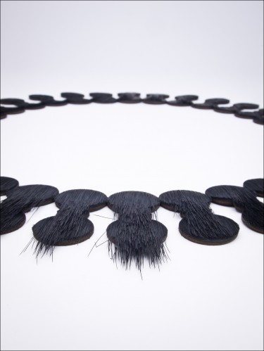
The flatbeads necklaces are showing the imperfection of the “perfect” industrial machine.

Flatbeads by Lore Langendries

Flatbeads


Mieke Dierckx

BULLONES

“Bullones”: Unpredictable volumes

These objects arose out of an interest to give handcraft a three-dimensional look. In the search for applicable techniques, an interesting design was discovered when combining two materials. Namely  a rubber balloon as support for a crochet cotton net. By not following a predetermined pattern, the openings in the net are each time different. This causes an unpredictable design which is adapted by applying openings, cuts, shiny coatings,…

http://www.miekedierckx.be

Bullones by Mieke Dierckx

Bullones


Maison Caro

THE TOOL BOX & VISUAL COOKBOOK

A collaboration between Maison Caro & studio pieter stockmans.

Maison Caro designed a new tool using objects from the collections of the pieter stockmans studio . Very subtle changes to the objects were made to fit a weighing system. A system that can be used as a kitchen utensil, combined with a visual cookbook in order to create a new cooking experience. This measuring and weighing system evolved from the simple and pure form of these objects.

http://www.maisoncaro.be

The toolbox & visual cookbook


Johan Bruninx

ROCOCO

Johan Bruninx graduated from the prestigious Design Academy in Eindhoven.

Fascinated by the past he experiments with materials and techniques.

By mixing the past and present he transforms lost objects into something precious.

Wax horns or steel butterflies. Toys in noble metals.

http://www.bruninx.com

Rococo


Michael Verheyden

UNDERSTATED CHIC, FOR THOSE WHO CARE

Michaël Verheyden (1978) is a Belgium based designer. Passionate about rock music, but probably also inspired by silence, he creates fashion accessories and home objects.

In 2002 he started his own company producing leather bags and accessories, hence his mastering of this material. He now even uses leather for his recently launched home collection, alongside solid wood, marble, linen, … . He prefers noble and durable materials that feel natural and age beautifully .

Apart from his quest for good quality fabrics, Michaël Verheyden puts a lot of time into finding new ways to construct things. He always tries to combine innovation, craftsmanship and quality into clean-cut, purified designs.

http://www.michaelverheyden.com

Doblo familie by Michaël Verheyden

Doblo Famillie


Linde Hermans

TILTING

Linde Hermans started her own design studio in 1999, Houthalen Belgium. Besides various design projects for companies and organizations, she creates objects for her own label ‘RODE SCHOENTJES’. Her designs have an affinity for arts and crafts, but still characterized by a more functional and industrial development.
She uses recognizable images, symbols and stories – usually with a twist – and seeks a readable result for the viewer.

http://www.lindehermans.be

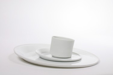
Tilting by Linde Hermans: porcelain tableware for Studio Pieter Stockmans, 2011

Tilting, porcelain tableware for Studio Pieter Stockmans, 2011


Sofie Lachaert

VANITAS  candle holder 2010-2011

Sofie Lachaert & Luc dHanis (Belgium) are working together for more than 20 years.

In their collective projects, they simply ignore the boundaries between art and design. Their subtle interventions lend everyday objects a new significance, an unexpected beauty.

VANITAS candle holder 2010-2011

With their re-interpretation of a seventeenth century vanitas symbol, Lachaert and dHanis go back to the past. To a century in art of painting when a lot of the depicted objects had a double, moralistic meaning; pile of books refers to our mortality and the transience of gathered, earthly knowledge. Vanitas symbolism played an important role and the elements referring to the temporariness and meaninglessness of this earthly live.

In this dhanis & lachaert’s vanitas interpretation a number of traditional references converge. The burning candle points to the passing of time, the books , once a symbol of wisdom, now transferred into a decorative object , each book with a hidden story, completed with the personal story of the previous owners.

http://www.lachaert.com

Vanitas, candlestick 2010-2011


Brecht Duijf

18-11-81 garments: Garment as product, not as part of a collection but every piece being a whole.

BRECHT DUIJF COLOURINGS: Colour isn’t abstract for Brecht. She implies colour with reasoning. Within things and spaces.

Brecht Duijf: Her objects are a clear statement, how this statement relates to space and context is a question which is answered in the combination of color, material and size, the function is embedded.

http://www.brechtduijf.com en http://www.18-11-81.com

Brecht Duijf


Next Page »